The design of my logo incorporates elements that represent three key features of my brand. Use the sliders and take a look!
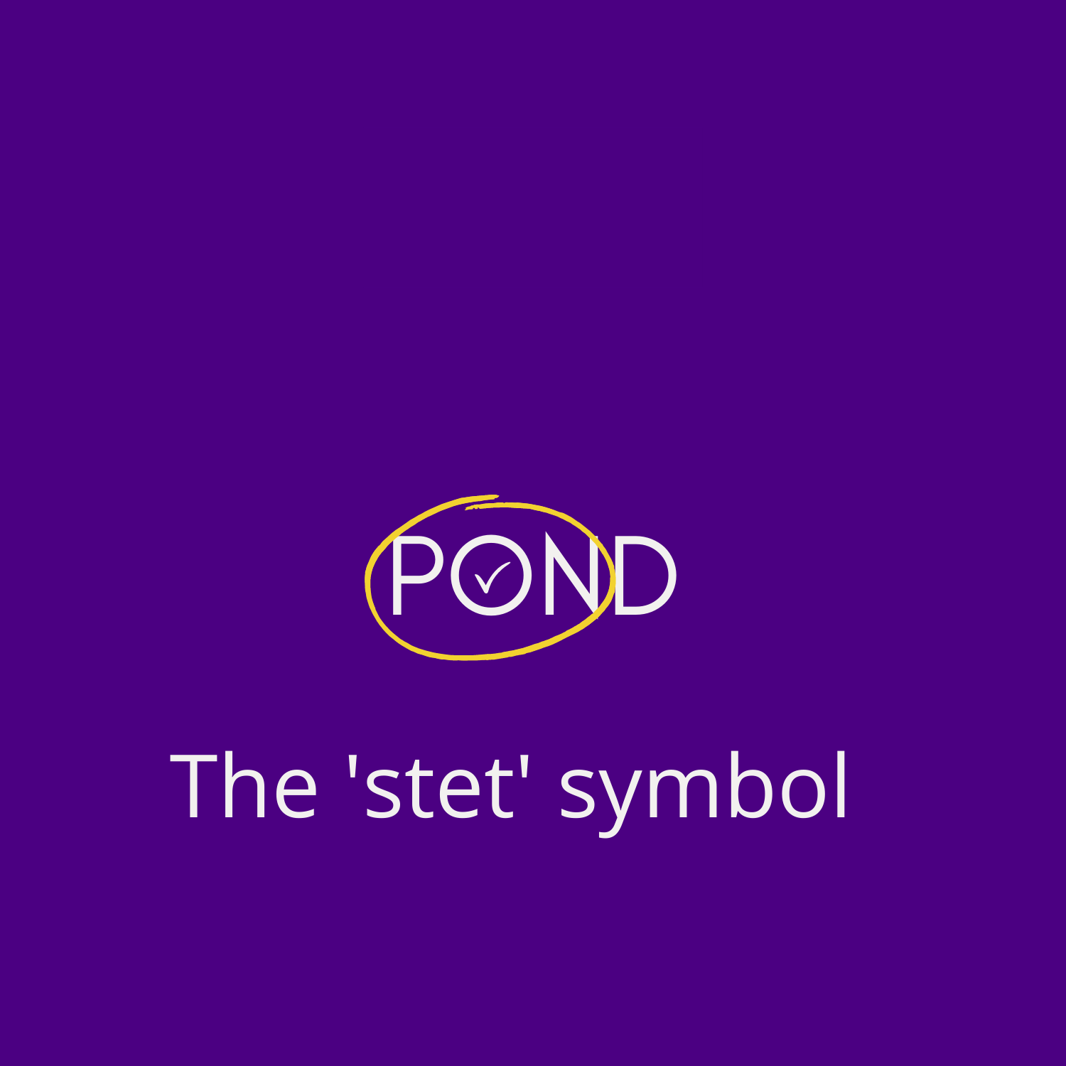
ELEMENT ONE: The ‘stet’ symbol
The ‘stet’ symbol – a tick enclosed in a circle – is one of a series of symbols used by proofreaders and editors* to mark a client’s work. ‘Stet’ means ‘let it stand’ or ‘leave unchanged’ in Latin.
This mark symbolises my commitment to ‘stet’ whenever I can. I will only make changes to your work when they are necessary. This is because the voice your readers want to hear does not belong to me; it belongs to YOU.
*This is the stet mark according to the BSI marks for copy preparation and proof correction, which I learned to use during my training. I acknowledge that my colleagues from other parts of the world likely use a different version!
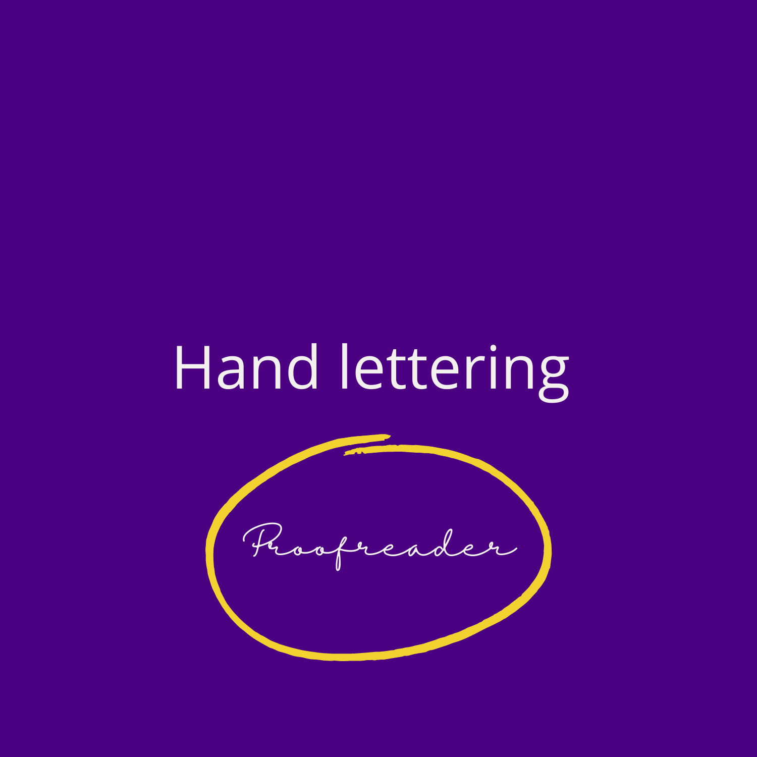
ELEMENT TWO: HAND LETTERING
The word ‘proofreader’ is written in a hand-lettered font.
This hand lettering represents that when you work with me, you’re working with a real person – one who understands the effort it takes to craft a piece of text and who will listen carefully to your brief.
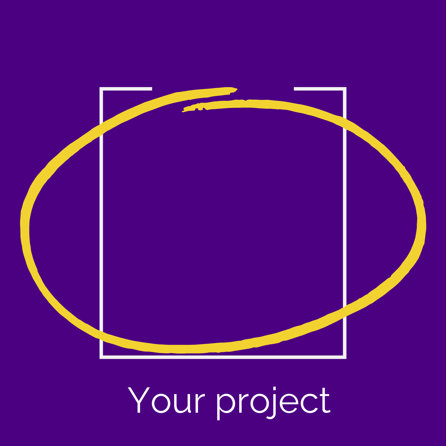
ELEMENT THREE: YOUR PROJECT
The outline of a rectangle encloses the other elements of the logo.
This outline symbolises your project. Is it a manuscript? What about a document? Or something on a screen perhaps? That’s up to you! It’s here to show you that I can work with a variety of formats, either before or after your work has been formatted.
Thanks for reading!